Beyond "Big Eyes": What Anime Style Actually Means
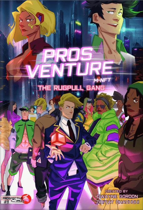
If you've streamed Cyberpunk: Edgerunners or Ghost in the Shell, you already know anime's emotional punch. But translate that aesthetic to the static page of a comic, and something fascinating happens. The visual language doesn't simply transfer—it transforms. Rise of the Rugpull Gang, the debut issue from Prospective Comics, offers a masterclass in this translation. Set on a ruined Earth where the TRON blockchain has become literal infrastructure, the series deploys anime's distinctive grammar across every panel. Understanding that grammar—line weight, screen tone, panel rhythm, and character design conventions—reveals why this style commands such devoted global readership.
Line Weight: The Pulse of Emotion
Western comics traditionally vary line weight for physical realism: thick outlines for foreground objects, thinner lines for distance. Anime inverts this logic. Line weight becomes emotional instrumentation.
In Rise of the Rugpull Gang, examine the unnamed woman's first appearance stepping from the portal into half-buried Baltimore. Her silhouette carries deliberate weight—not because she's physically imposing, but because the moment demands gravity. The ruined architecture behind her receives thinner, almost trembling lines suggesting instability and age. When she summons the red machine from the sand, the line weight shifts dramatically: mechanical edges grow crisp and decisive, while the desert itself dissolves into scratchy, uncertain strokes.
This is anime's visual hierarchy at work. Important elements don't merely appear larger; they exist with more certainty. The line itself breathes. Compare this to the New Manhattan sequences where the Rugpull Gang operates. Zwycz's laptop—central to whatever operation has the crowd mesmerized—receives heavy contour lines even when background details fade to near-abstraction. The technology matters more than the architecture. The emotional stakes determine the ink.
Screen Tone: Texture as Narrative
Traditional Western comics achieved shading through cross-hatching or solid blacks. Manga pioneered screen tone: patterns of dots, lines, and gradients that create texture without flattening the image into pure color or pure shadow. Anime-style comics inherit this vocabulary.
Rise of the Rugpull Gang deploys screen tone with surgical precision. The desert sequences use coarse, sandy patterns that seem to vibrate on the page—visual static matching the harsh environment. When the unnamed woman rides east, the machine's surfaces carry smooth gradient tones suggesting manufactured perfection against organic decay. New Manhattan, floating above the wasteland, reverses this: the levitating platform's underside carries mechanical cross-hatching, while the city above glows with clean, almost absent tone—heaven rendered as negative space.
Prince, visible in the venue scenes, demonstrates how screen tone constructs character presence. Where Western comics might use solid shadow to suggest menace, anime-style rendering layers tone to create atmosphere. The effect is less "here is a villain" and more "here is someone who carries their own weather." Zwycz, working beside him, receives sharper tonal contrasts—technical precision rendered through visual precision.
The "Muscular" and "Legendary" tiers visible at prospective.world/gallery extend this logic to collectible artifacts. These M-NFTs don't merely display characters; they demonstrate how screen tone scales across rarity tiers, with higher multipliers receiving more sophisticated tonal layering. The visual language becomes economic language.
Panel Rhythm: Time Made Spatial
Western comics typically follow cinematic grammar: wide establishing shot, medium shot, close-up, action sequence. Anime-style pacing operates differently. Time expands and contracts through panel size and shape rather than sequence alone.
Rise of the Rugpull Gang structures its two narrative strands through deliberate rhythmic contrast. The unnamed woman's journey receives tall, narrow panels—vertical emphasis suggesting forward motion, the road, the portal's aftermath. Her dialogue with Lecky unfolds in these elongated spaces, AI communication rendered as something that stretches time rather than interrupts it.
The New Manhattan sequences explode into wider ratios. The packed venue demands horizontal breathing room. Zwycz's operation spreads across panel gutters that seem to pulse with the crowd's energy. When these strands finally approach convergence—her first sight of the floating city—the page layout itself becomes the narrative device. Wide horizontal panel: "So this is New Manhattan." The rhythm pauses. The vertical traveler meets horizontal spectacle.
This is anime's temporal architecture. Where Western comics often accelerate toward action, anime-style pacing lingers in transition. The journey matters equally with the destination. The 24-page count of Issue 01 isn't limitation; it's sonnet form, demanding compression that resonates through deliberate pacing choices.
Character Design: Codification and Deviation
Anime character design operates through recognizable archetypes that then deviate. The base vocabulary—eye scale, hair volume, body proportions—creates immediate readable identity that individual artists then personalize.
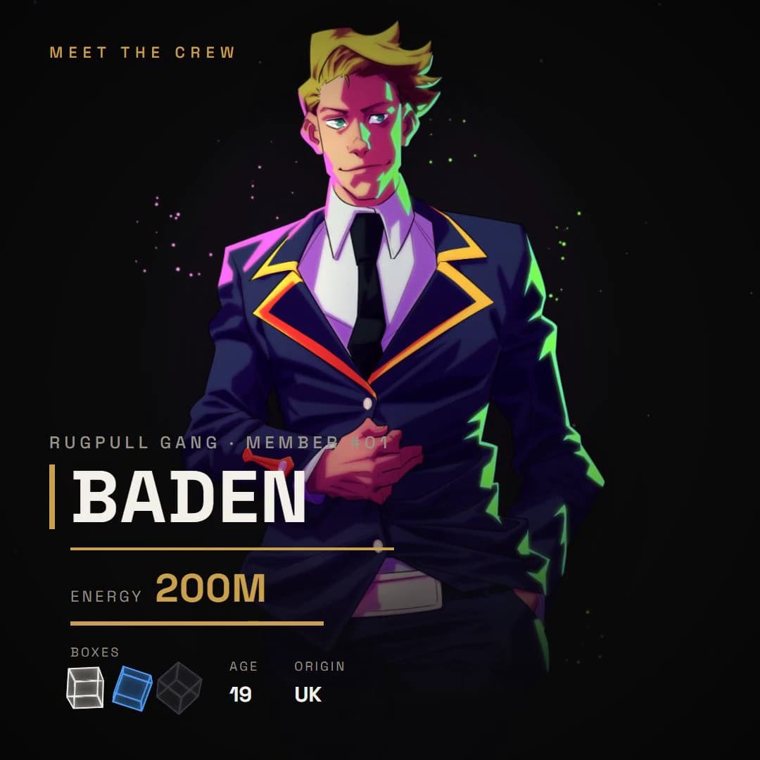
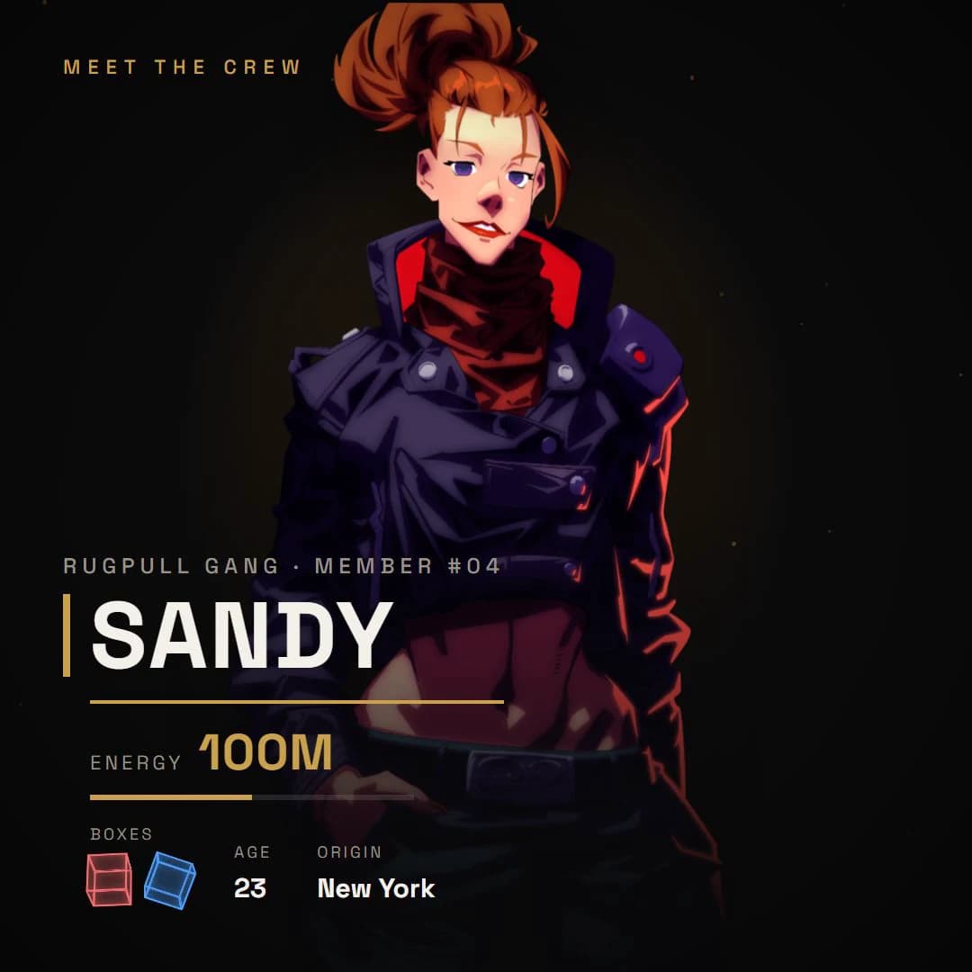
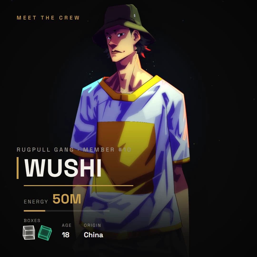
The Rugpull Gang's fifteen members, viewable at proscomics.com/characters/, demonstrate this system. Each carries the anime base: expressive eyes that function as emotional amplifiers, hair that defies physics for silhouette recognition, proportions that prioritize dynamism over anatomical accuracy. Yet within this shared language, individual deviation creates distinction.
Zwycz's design emphasizes technical precision through controlled line economy—suggesting someone whose appearance reflects operational focus. Prince's presence carries more dramatic contrast, shadow and highlight playing across features that suggest history without explaining it. The unnamed woman breaks pattern deliberately: her design withholds the expected anime signifiers of personality type, creating narrative mystery through visual restraint.
The M-NFT tier system—Common through Legendary, with multipliers from x2 to x6—formalizes this design language into collectible hierarchy. Higher tiers don't merely add detail; they amplify the anime visual grammar itself. More sophisticated screen tone application. More dynamic line weight variation. More elaborate panel-breaking composition. The blockchain infrastructure becomes visible through aesthetic escalation.
The Infrastructure Beneath the Style
What makes Rise of the Rugpull Gang particularly significant is how its anime style interacts with its TRON blockchain setting. The series doesn't simply adopt anime aesthetics as genre dressing. The visual grammar becomes thematic statement.
The modifiable M-NFTs advertised as "first modifiable NFTs" extend this logic. Anime style itself is modification—of Western comics conventions, of cinematic grammar, of cultural expectation. The "PROS VENTURE M-NFT" footer on every MEET THE CREW card announces that the visual language and the blockchain infrastructure share operational principles: established systems made flexible, readable codes made personal.
The print edition—available at £24.99 through Stripe, requiring no wallet or tokens—preserves this accessibility. Anime's democratic visual language meets blockchain's promised democratization, delivered through traditional comic format. No technological barrier separates reader from art.
Reading the Language
Understanding anime style as visual grammar rather than surface aesthetic transforms how you read Rise of the Rugpull Gang. You begin tracking line weight as emotional emphasis. You feel screen tone as environmental pressure. You experience panel rhythm as narrative breathing. You recognize character design as archetype and individual simultaneously.
This is the education the series offers. Issue 01 establishes the vocabulary. The journey toward New Manhattan, the gang's operations within it, the portal woman's approaching convergence—these become exercises in reading a visual language that millions worldwide already intuit, few critically examine.
Explore the character designs and tier systems at proscomics.com/characters/ and prospective.world/gallery. Then experience how these elements animate across the page in the print edition at proscomics.com/comic. The grammar awaits your attention.